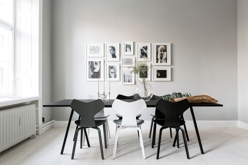
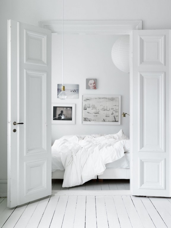
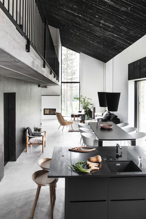
The other day, I came across an article on Elle Decor titled "25 Black & White Interiors That Prove Less Is More." The spaces featured were effortlessly stylish—timeless, chic, and undeniably elegant. As I scrolled through, I found myself reflecting on the phrase in the title: less is more.
But is it really?
The Ambiguity of "Less Is More"
"Less is more" is a phrase that divides opinion. While some embrace it as a guiding design principle, others argue that it oversimplifies creativity and expression. The power of the phrase lies in its context—how it’s used, interpreted, and applied.
Take Pablo Picasso’s Bull’s Head (1943), for example. Without context, it’s simply a leather bicycle saddle attached to inverted handlebars. But when viewed through the lens of minimalism, the piece becomes something more—a striking representation of a bull’s head, achieved with the most minimal of elements. The beauty of the work lies in its reduction of unnecessary details, forcing the viewer to engage, interpret, and find meaning in its simplicity.
The Power of Reduction
Minimalism often leads to timelessness. When stripped of distractions, an artwork, a sentence, or even an interior space can become more impactful. A brilliant example of this is a two-sentence story by Richard Brautigan from Revenge of the Lawn (1962-1970):
"It’s very hard to live in a studio apartment in San Jose with a man who’s learning to play the violin.” That’s what she told the police when she handed them the empty revolver.
Nothing is wasted. Every word carries weight. The brevity adds to its dark humor and emotional punch.
Minimalism in Design
This principle holds true in architecture and interior design as well. Just like Picasso’s Bull’s Head or Brautigan’s writing, a well-designed minimalist interior is about more than just removing excess—it’s about carefully curating what remains. The black-and-white spaces in Elle Decor’s feature work because they aren’t just empty; they are thoughtfully composed, using contrast, texture, and form to create impact.
Bridget Riley, a pioneer of optical art, built her career on a similarly restricted palette—black and white, with occasional color. Yet, with this limitation, she produced some of the most iconic images of the last century.
So, Is Less More?
The answer depends on intent. Less can be more when it’s deliberate, when every element serves a purpose, and when simplicity enhances, rather than limits, creativity. Whether in art, literature, or interior design, the power of minimalism lies not in what is removed, but in what is left behind.
_-_Bulls_Head.jpg)
Pablo Picasso’s (1943) ‘Bull's Head’ - Image source: http://ow.ly/4mYyAy

'Fashion Squad': Carolina Engman - http://ow.ly/4mYzRK

'Fashion Squad': Sharyn Cairns (FOR INSIDE OUT) - http://ow.ly/4mYAg8

'Daily Dream Decor' - http://ow.ly/4mYAv7
_-_Fall.jpg)
Bridget Riley (1963) - Fall
Article originally written in 2017 by Pierre-Edouard Duedal - Refreshed in 2025 by Viero UK Ltd. (www.viero.co.uk)


